About WP Engine

Hassle-Free WordPress Hosting

WP Engine is one of the most mature, premium managed hosting platforms for websites and apps built with WordPress. WP Engine works with companies such as HTC, Discovery Networks, Williams Sonoma, the Country Music Association, and Fortune 50 financial firms. WP Engine powers tens of thousands of websites, delivering reliable and secure web experiences. Businesses large and small have come to rely on WP Engine’s customer service team that specializes in solving problems ranging from troubleshooting plugins to mitigating site migration headaches.

Vocabulary

WP Engine refers to their management admin screen as ‘the portal’. The portal is a collection of ‘installs’ on an account. An ‘install’ represents an individual WordPress website. Each installs has hosting features, which are configured for that specific install.

Below is an example of the WP Engine Portal as it exists today. All the installs on my account are listed on the left, with the current ‘mysite’ hosting feature navigation open:

existing portal

Design Context

I have been using WP Engine to host this portfolio site and with my freelance clients for nearly 2 years now. I’ve seen the platform grow, rebrand, and most recently greatly improve the user experience. WP Engine continues to add amazing features to it’s portal like Automated SSL certificates, Git SSH key management, and most recently the Migration Assistant. As WP Engine continues to add more features, and as I continue adding installs to my account, I’ve found navigation slowly breaks down and I’m left to navigate a sea of installs.

This got me thinking about how WP Engine’s install management could be improved for users with lots of installs on their accounts. Solving this problem is ideal both for power users, as well as WP Engine’s bottom line. The more installs a customer has on their account, the more money WP Engine can charge. This creates an incentive to make it easy for customers to easily add and manage more installs on their accounts.

Pain Points

WP Engine needs a way to scale navigation while also making it easy for customers to manage all of their installs. Currently to get to a specific page from one install while in another, customers have to:

  1. Find and click the Install they want (this may involve scrolling the page if you have more than ~15 installs)
  2. Wait for the page to reload on the overview page for that install
  3. Click the Install Feature they want

There are some great opportunities to improve functionality. Specifically pivoting between installs and providing quick navigation to frequently accessed installs.

User Research

Having now identified a design problem and understood the underlying pain points, I would usually take time at this point to dedicate to user research. While I obviously don’t have WP Engine’s customer list, if I did, I would reach out to customers who had large numbers of installs on their account, and recruit them for user research testing. My initial goal would be to find patterns and similarities in pain points for my targeted customer base. I would validate the pain points I’ve listed above, and observe how customers are currently overcoming any issues. In this case it may be a customer using the browsers ‘Search Text’ functionality to find an install, or bookmarking frequently accessed install overview pages. These observations would all help validate and scope out the point points for the existing portal design.

For the scope of this case study, I will use my own experience with the portal. Having been a long time customer of WP Engine I have noticed myself some of the pain points listed above.

Wireframe

Below is a final wireframe that was part of a quick sketching sessions where I quickly iterated through a few ideas at extremely low fidelity. This quick iterative process allowed me to quickly refine my initial ideas addressing the above pain points.

wireframe

Mockups

Once I landed on a solution I liked from my quick iterative sketching session, I decided to quickly make the leap to high fidelity mockups.

Quick Install Navigation

The first step in improving the navigation experience between installs is to remove the extra click and page reload when navigating between installs.

The numbered points I outline below correspond to the numbered callouts on the below mockups.

1. The install navigation now acts as a true accordion, you can click the current install title to have it minimize down.

Click the image below for a larger preview.

2. Clicking on a non-active install title expands that install’s sub-navigation and minimizes the current active install’s navigation. This allows a user to quickly navigate between installs and between features without having to wait for a page reload.

Click the image below for a larger preview.

Pinned Installs

The next improvement is to allow frequently accessed installs to be “pinned” to the top of the installs navigation. This would be a per account user feature, allowing different account users to pin different sites according to their various needs.

3. Clicking the thumb tack icon next to an install pin’s it to the top of the install navigation. Pinned installs are listed alphabetically separate from the remaining list of alphabetized installs. The titles also turn green to help indicate they are ‘pinned’.

Click the image below for a larger preview.

Install Filtering

The final improvement is to empower a user to find the install they are looking for easily and quickly rather than scanning the entire install list, and scrolling the page if there are many installs on an account.

4. Typing in the ‘filter installs’ filter box refines the install nav to show only matching installs. A user can then use the quick install sub-navigation to jump into whatever relevant feature on that install they want. 

Click the image below for a larger preview.

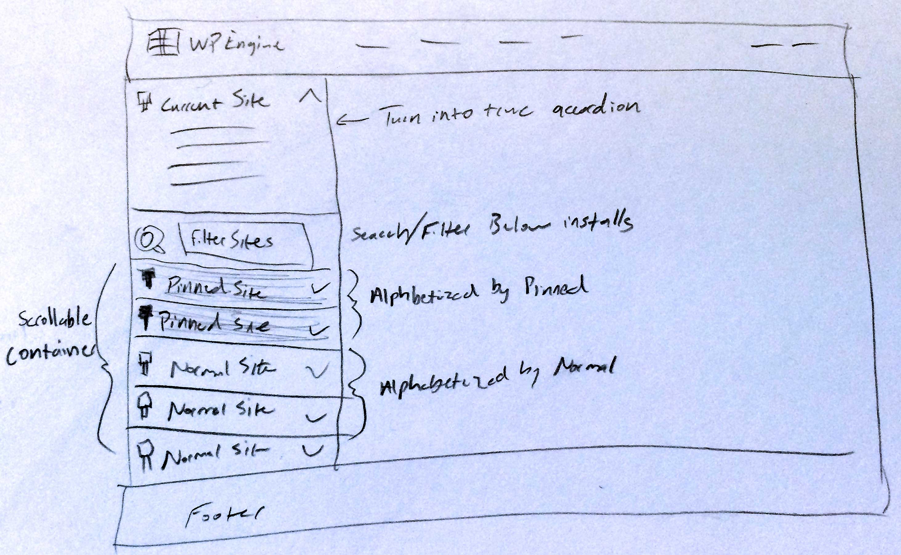
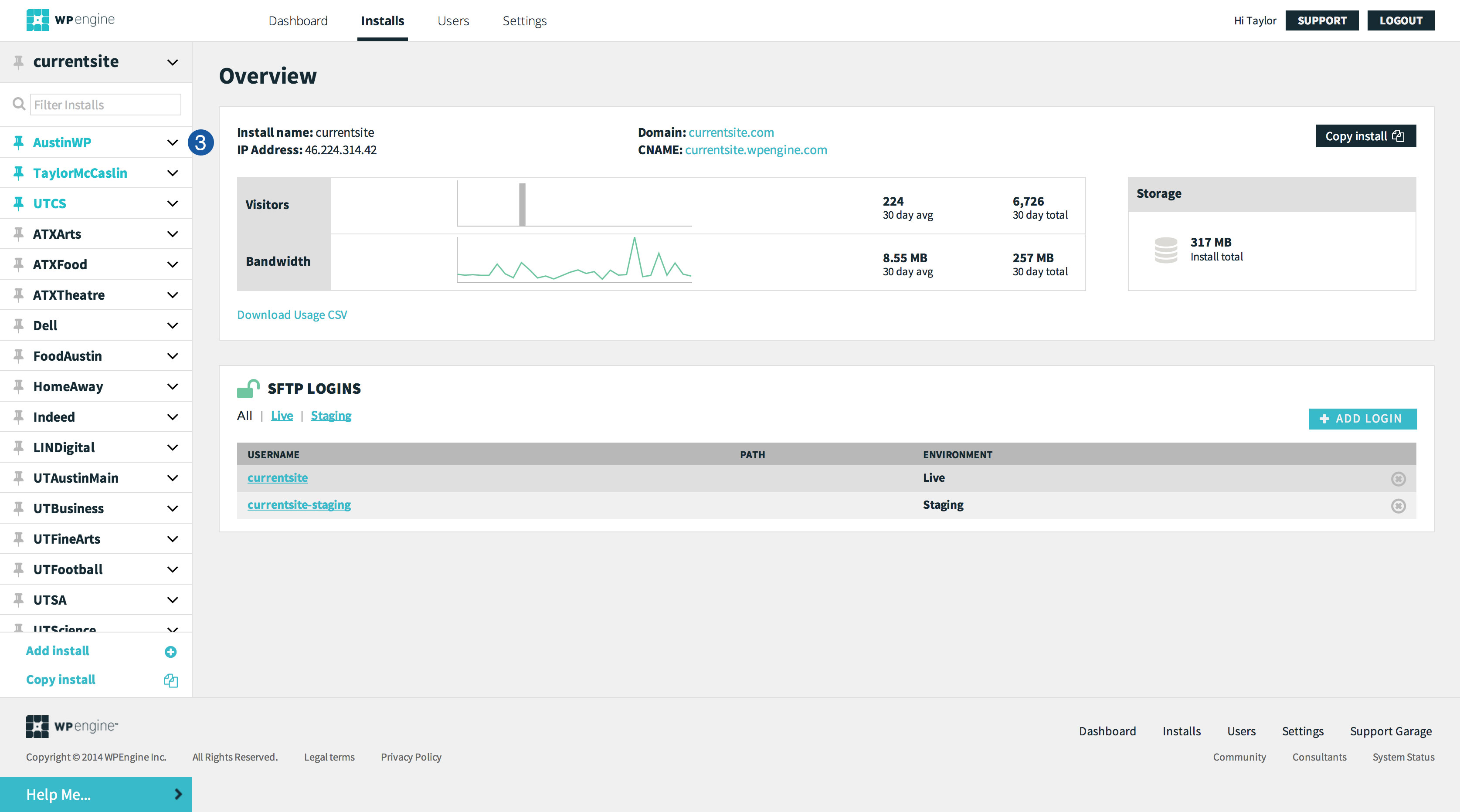
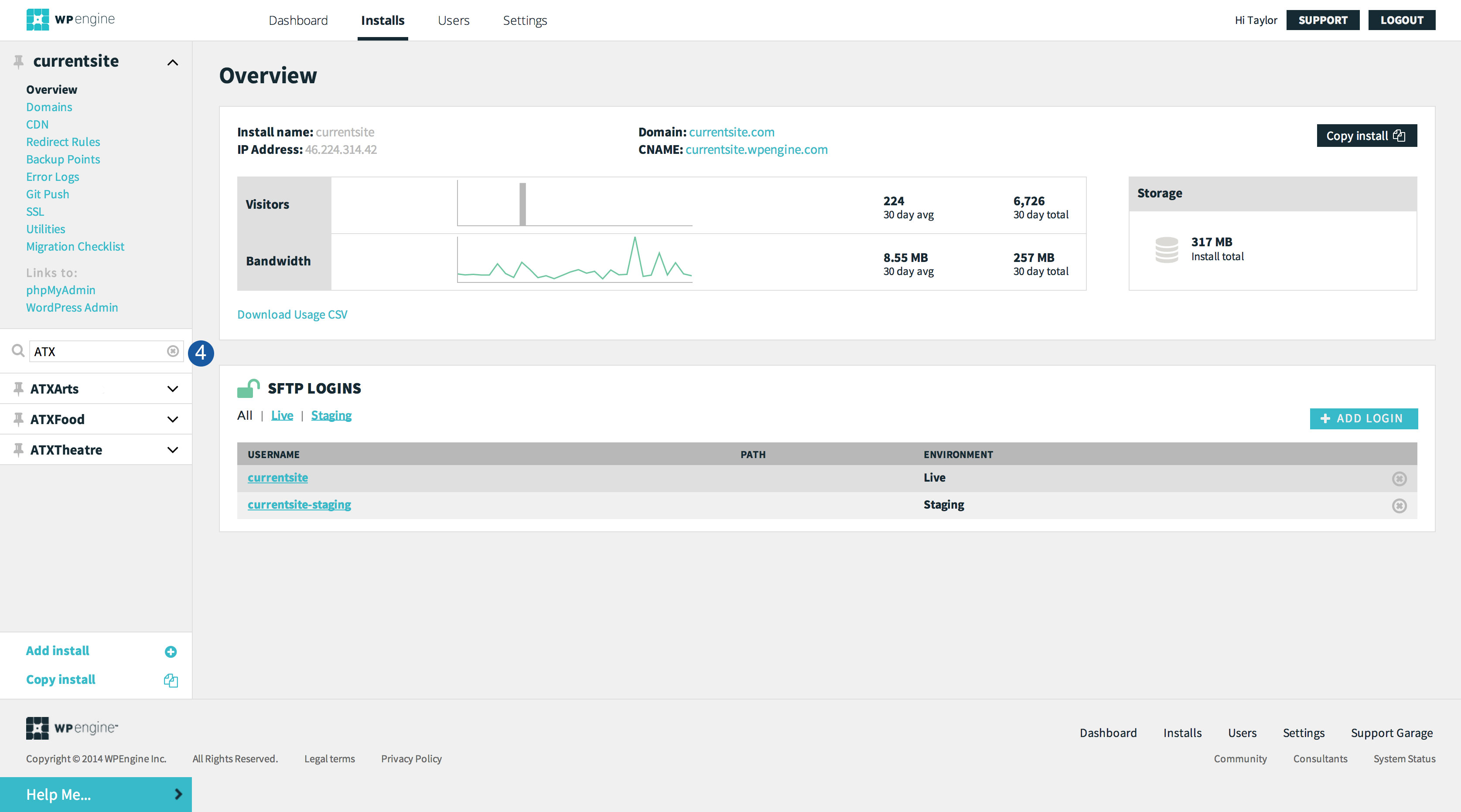
Interaction Prototyping

I will not dive into deeply prototyping interactions in this case study. However, I did do some research and quickly found an open source jQuery plugin called list.js, which could easily be implemented to filter the install list. Below is a quick demo of list.js filtering the titles of installed used in my above mockups.

7794


Wrapping up

I’ve spent about 3 hours total on this concept. It’s still a rough initial idea, but I was able to quickly develop it into high fidelity mockup. Next steps would include fully prototyping interactions and putting it in front of users with lots of installs on their accounts in controlled usability tests. Assuming testing goes well, I would start A/B testing this experience within the portal. My initial thought is to test the new navigation for all account levels, while reserving the account filtering for Business and Enterprise accounts (as filtering isn’t really helpful unless you have more than ~15 installs).

I believe these improvements will largely improve the user experience for users who have lots of installs on their accounts. By improving install management and navigation customers will be more likely and willing to manage even more websites with WP Engine, and in turn increase WP Engine’s recurring revenue.

I hope this case study has given you further insights into my skills, as well as a taste of my visual design and user experience capabilities.


Close
Go top